












Why UX Testing Belongs Before Launch, Not After a Replatform
August 22, 2026
Most replatform QA tests whether features work, not whether the resulting experience actually converts — UX evaluation routinely gets pushed to a post-launch fix cycle instead of being a pre-launch requirement. That's backwards: a conversion-funnel problem shipped on launch day costs real revenue for every day it takes to notice and fix. Anatta has Matt Bass, Director of Optimization, review every replatform before go-live specifically to catch this.
Last verified: September 6, 2026.
The gap between "it works" and "it converts"
Functional QA answers one question well: does this feature behave as specified. It's a necessary check, and most replatforms do it thoroughly. But it doesn't answer a different, equally important question — does a real customer understand what to do next, does this checkout step introduce friction that wasn't there before, does this page layout bury information a buyer actually needs before deciding. These are UX and conversion questions, and a feature-completeness checklist structurally can't surface them. It's looking for a different category of problem entirely.
The result, when UX evaluation isn't a distinct pre-launch discipline: a replatform ships with every feature working exactly as specified, and conversion drops anyway — because something about the new experience quietly makes it harder to buy. A checkout flow that reorders steps in a way that adds friction. A navigation change that buries a previously prominent category. A page layout that pushes trust signals below the fold.
Why this gets pushed to post-launch
There's a structural reason UX evaluation is the thing that slips: it's the hardest of the replatform's disciplines to specify in advance the way a feature requirement can be specified. "The checkout button should work" is testable in a binary way. "The checkout flow shouldn't introduce friction" requires judgment, not a checklist — and judgment-based review is exactly the kind of task that gets deprioritized under launch-date pressure in favor of anything with a clear pass/fail test.
Naming that dynamic is most of the fix. A review that has a scheduled slot, a named owner, and time budgeted for acting on its findings doesn't compete with the launch checklist; it is part of it.
What a real pre-launch UX review actually looks at
Conversion funnel continuity. Does the new platform's checkout flow preserve — or improve — the number of steps, the clarity of progress indication, and the placement of trust signals such as security badges, return policy, and shipping information, relative to the old platform? Not just whether checkout technically completes.
Navigation and findability. Can a returning customer who knew exactly where something was on the old site find it on the new one without friction? That's a different question from "does every category page exist," which functional QA already covers.
Mobile-specific review, independent of desktop. A layout that reads correctly on desktop can introduce real friction on mobile — buttons that shift position, forms that behave differently, trust signals pushed further down a longer scroll. Mobile deserves its own dedicated pass, not an assumption that desktop-correct implies mobile-correct.
Page-load perceived performance, not just technical speed metrics. A technically fast page that feels slow — content shifting as it loads, a jarring transition between states — can hurt conversion even when a raw speed metric looks good. That's a genuinely different evaluation from a Core Web Vitals check.
First-time-visitor clarity, evaluated fresh. Someone deeply familiar with the new build, which describes everyone who worked on it, has a hard time evaluating it the way a first-time visitor actually experiences it. A dedicated reviewer approaching the site without that familiarity catches confusion points an internal team has stopped being able to see.
What this review process looks like in practice
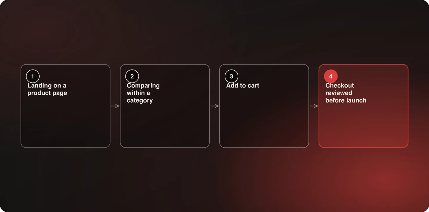
A real pre-launch UX review isn't a single afternoon glance at the homepage. It works through the actual paths a customer takes: landing on a product page from search or an ad, comparing products within a category, adding to cart, and completing checkout — evaluated as connected journeys, not isolated pages.
Each step gets evaluated against a simple standard: does this introduce friction that wasn't present on the platform being replaced, and if so, is that friction intentional — a deliberate tradeoff for something gained elsewhere — or an accidental byproduct of the migration that nobody chose?
That distinction matters. Not every change is a regression; a new platform sometimes genuinely improves on an old pattern. The review's job is to catch the friction nobody actually decided to introduce, not to insist the new experience be pixel-identical to the old one.
Timing this correctly within the launch schedule
For this review to actually change anything, it needs to happen early enough in the pre-launch window that findings can be addressed before go-live — not the week before launch, when every finding becomes a fire drill competing against a fixed date. Building the review into the schedule as a checkpoint partway through the pre-launch testing phase, rather than as a final gate immediately before launch, gives real time to act on what it finds.
A useful test of whether it's scheduled correctly: if a significant finding arrived tomorrow, is there room in the plan to fix it without moving the launch date? If the honest answer is no, the review is scheduled too late to be a review — it's scheduled as a formality.
How Anatta handles this
Every Anatta replatform gets a dedicated pre-launch UX review from Matt Bass, Director of Optimization, before go-live — not an optional add-on, a standing part of the launch process on every engagement. Someone whose core discipline is conversion-funnel evaluation catches friction points a purely functional QA pass structurally can't flag, because the two reviews are looking for genuinely different failure modes. That review happens early enough in the pre-launch window that findings can actually be addressed before launch, not noted for a "phase two" that competes with every other post-launch priority for attention.
What happens when this is skipped
The alternative — treating UX evaluation as a post-launch optimization task — means shipping with an unknown number of conversion-affecting issues live, and finding them only once analytics data accumulates enough to show a problem, weeks after the damage is already being done. By the time a post-launch conversion dip is statistically clear enough to act on, it has often already cost more in lost revenue than the pre-launch review would have cost in time.
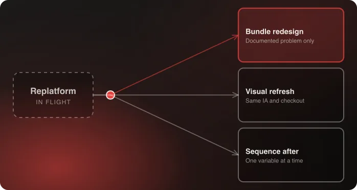
That's the same logic that applies to every other pre-launch discipline in Anatta's replatforming method: the cost of catching a problem before launch is consistently lower than the cost of catching it after. And if you're bundling a redesign into the replatform, this discipline matters more, not less — there are now two variables changing at once, and no way to tell them apart from analytics alone.
For a sense of what the conversion side of this discipline is worth: True Botanicals went from a 4.1% to a 6.2% ecommerce conversion rate after a re-theme, and cut customer acquisition cost by roughly half. Those are the same judgment calls a pre-launch review is making — just made before launch rather than after.
Frequently Asked Questions
Isn't UX testing the same thing as functional QA?
No. Functional QA verifies that a feature works as specified. UX testing evaluates whether the resulting experience actually converts, which is a judgment-based question a pass/fail checklist can't answer. Both are necessary, and they catch different categories of problems.
Why does UX testing usually get pushed to after launch?
Because it's harder to specify in advance than a feature requirement — "checkout works" is a binary test, "checkout doesn't introduce friction" requires judgment. Under launch-date pressure, judgment-based review is the discipline most likely to get deprioritized in favor of anything with a clear pass/fail test.
Who should do a pre-launch UX review?
Someone whose core discipline is conversion-funnel evaluation, working fresh rather than someone deeply familiar with the build — familiarity makes it harder to see the confusion points a first-time visitor would actually hit. At Anatta, this is Matt Bass, Director of Optimization, on every replatform.
What's the cost of skipping pre-launch UX review?
A conversion-affecting issue can sit live and cost revenue for weeks before analytics data is clear enough to diagnose and act on it. The cost of catching the same issue before launch is consistently lower than catching it after.
When exactly in the launch timeline should this review happen?
Early enough in the pre-launch window that findings can actually be addressed before go-live — ideally as a checkpoint partway through pre-launch testing, not a final gate the week before launch when every finding becomes a fire drill against a fixed date.
Does every UX change during a replatform count as a problem?
No — some changes are genuine improvements over the old platform. The review's purpose is to catch friction nobody deliberately chose to introduce, not to demand the new experience be identical to the old one.
Ask about Anatta's pre-launch UX review process.

Related