12 Ways to Improve Your eCommerce UX for Higher Conversions on BFCM 2025
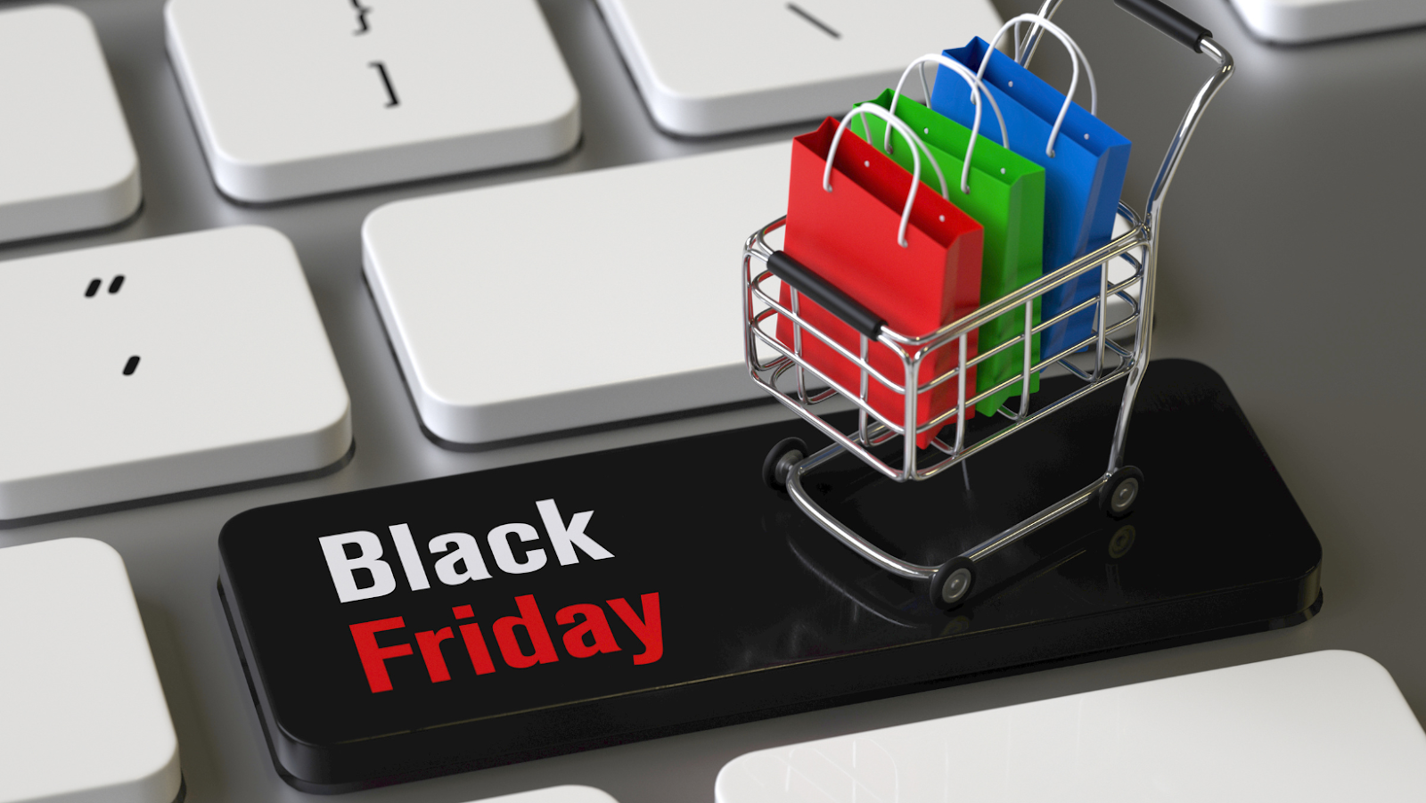
It probably won’t surprise you to learn that 30% of all annual retail sales take place between Black Friday and Christmas. That’s a 4-week period when everything has to go right for your eCommerce website.
For DTC businesses, Black Friday and Cyber Monday (BFCM) are two of the highest revenue-generating days of the year. According to a report from Adobe, 2022 Black Friday sales broke previous records with $9.1 billion in sales, up 2.3% from 2021. Cyber Monday was equally impressive, generating $11.3 billion.
Many analysts are predicting that the 2023 holiday shopping season will be even larger. eMarketer forecasts that the 2023 holiday season could see retail sales grow by 4.5% from 2022. And with CACs up across all eCommerce industries (up as much as 222% in some cases), BFCM may be an opportunity to acquire new customers for less, and even strengthen your customer loyalty.
This year, Black Friday weekend starts on Friday, November 24th. But eCommerce businesses should begin preparing for the holiday season as early as September or October.
BFCM Quick Stats
- $281B in global sales in 2022
- Cyber Monday was the single biggest eCommerce day of the year by revenue at $11.3B in the USA
- Analysts predict 4.5% gain for 2023 holiday season
Today, we’ll show you how a strong UX strategy improves conversion rates, so your website is ready to handle BFCM traffic.
In this article we’ll cover:
- The Black Friday and Cyber Monday opportunity, and how to be ready for it
- Why UX has a big impact on your conversion rates, and how to identify areas you can improve
- 12 high-priority UX fixes you can implement immediately for higher conversions this BFCM
12 High-Priority UX Optimization Ideas to Increase Conversions for BFCM 2025
In this article, we’ll focus on UX optimization ideas that can have the biggest impact for the least amount of work. That normally means focusing on the top and the bottom of your funnel. We’ll look at how to improve the UX of your product pages, shopping cart, and checkout process.
The goal is to allow customers to navigate through your website with as little friction as possible, so nothing stands in their way of making a purchase.
Here are 12 ways to optimize your website UX on Black Friday and Cyber Monday.
1. Why Site Speed is the Single Biggest Factor in a Good Store UX
Half of online shoppers expect a website to load in 3 seconds or less.
Website speeds are synonymous with security and good customer experience. A fast website will earn you more revenue. A slow website costs your brand consumer trust, and more than one potential customer.
And it’s not just about trust. B2C websites that load in 1 second have a 2.5x higher conversion rate than a site that loads in 5 seconds. That’s an enormous difference that can make or break the profitability of a DTC brand.
During BFCM, eCommerce brands can expect almost double the amount of inbound traffic. That means that this is the most vital period of the year to make sure that your website is optimized and running as smoothly as possible for an outstanding user experience.
Some easy ways to improve your site speed include:
- Code splitting: Helps a page load only what’s necessary. Instead of having all of your website load at once, split your pages and code into more than one piece. That way, only what is needed for a specific page is loaded first.
- Responsive image: Let a customer’s browser choose the images it needs to load based on their screen size.
- Prioritizing mobile: Try writing your code for mobile before desktop for better efficiency of time – and to ensure you have a great mobile site.
Clearly labeling your product categories and including them on the top-level navigation bar of your website is often the best way to help customers begin their shopping journey.
In addition, carrying your main navigation bar from one page to the next provides continuity of experience to customers as they browse through your website and move away from the homepage.
In this example from the outdoor apparel brand and Anatta partner, Stio, customers can easily navigate through categories and subcategories from the top menu. Even when customers have moved away from Stio’s homepage, they can still jump quickly between all four product catalogs. All they need to do is hover over the product category, and the main drop-down menu is accessible.
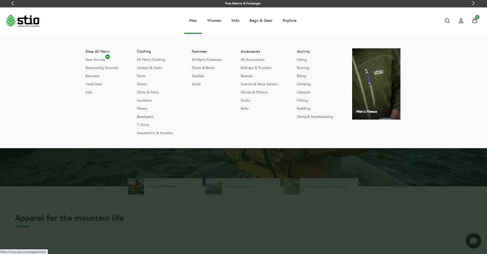
UX research has found that inconsistent menus can be confusing for customers. Designing your product navigation UX like Stio’s will reduce confusion and allow customers to seamlessly move between products and categories as they add items to their cart or narrow their purchase decision.
The easier it is for customers to explore your products, the more likely they’ll find what they’re looking for. And the easier the experience, the more likely it is to lead to a conversion.
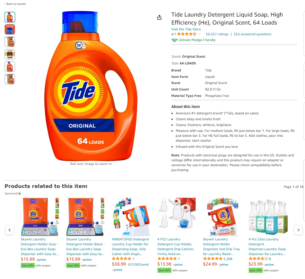
3. Upgrade the Photos and Descriptions On Your Product Detail Pages
Once a customer lands on your product detail pages (PDPs), they need two key pieces of information to convert.
First, your product descriptions should be easy to read.
Large blocks of text with no whitespace are intimidating, and readers will skim them. When that happens, customers miss out on essential product information that may have encouraged them to buy.
According to the Nielsen Norman Group, only around 16% of customers will read website content word-for-word, with the vast majority opting to scan content instead.
Break up your product description copy into bullet points that can be quickly scanned, and only include the most relevant information about the product.
The Strong Greens PDP from Bare Performance Nutrition uses creative bullet points with unique iconography and short, powerful sentences. This instantly conveys important information to the customer who can identify the benefits of the product at a glance.
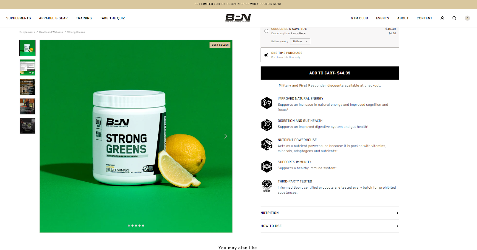
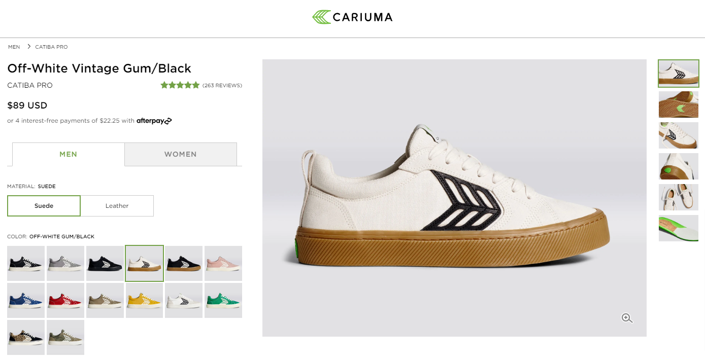
Second, your product images should be relevant, and high quality.
Providing customers with an online shopping experience similar to shopping at retail stores is one of the biggest challenges an eCommerce business faces.
Mack Weldon’s PDP for its Atlas Jogger pants shows customers the product from multiple angles. An eCommerce brand is limited in how much it can replicate an in-store experience on an online store. Including various high-quality images helps customers contextualize the product in their lives.
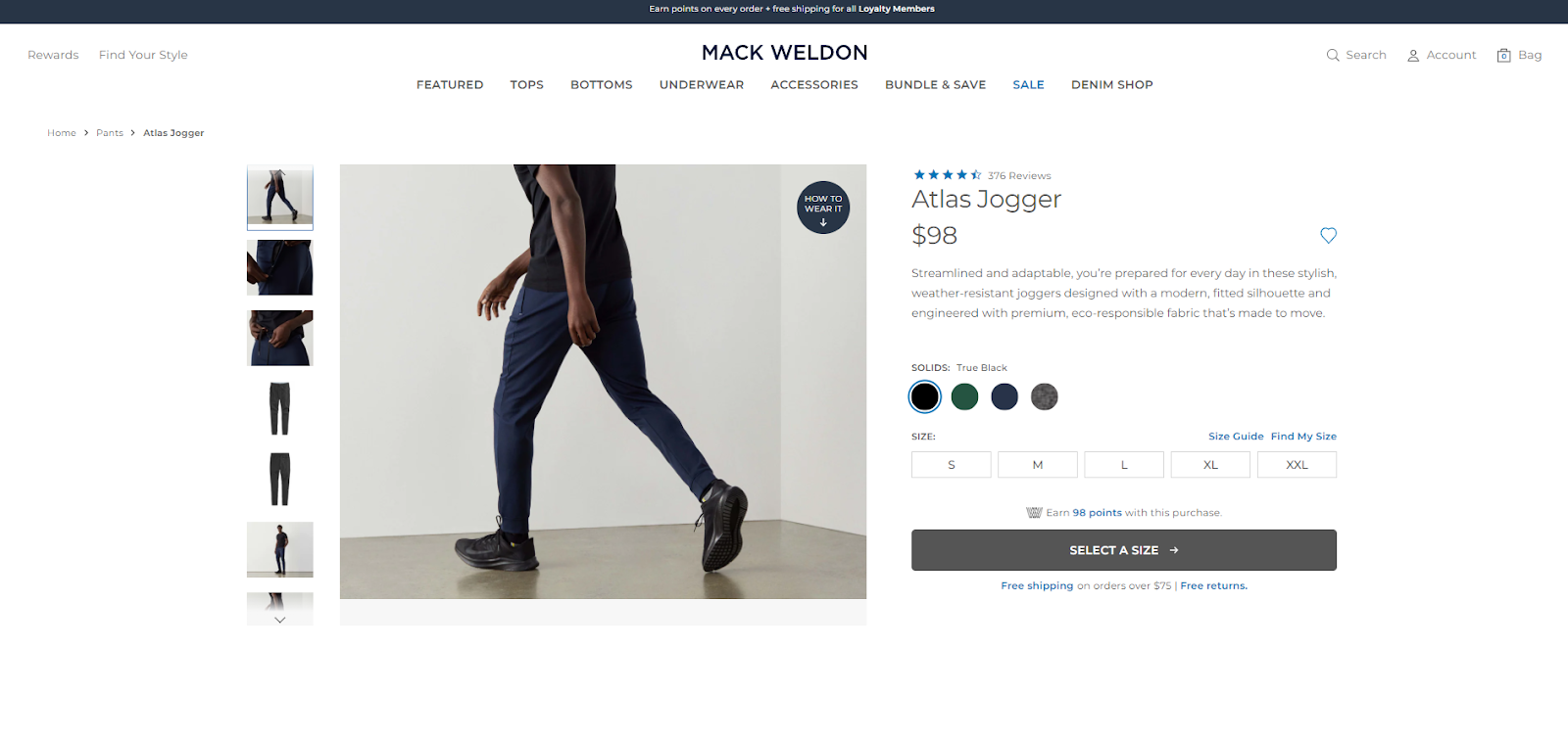
The right product images will lead to more conversions, and reduce returns. Clear product descriptions can help a customer gain a better sense of your product when they see it in use. This is especially true for apparel items, cookware, or furniture.
More pictures are better, and video is best if possible. In fact, according to research from Invesp, product pages that include video content convert up to 80% better than pages without video content.
Additional PDP Content Tips:
- Include product videos in your image gallery: Try to include product videos inside your product’s image gallery. Placing a product video below the fold lowers the chance a user will actually see your videos.
- Include a variety of angles: Creating a 360 view of your product through images helps showcase the product benefits you talk about in your product descriptions.
4. Make Shopping More Experiential by Investing in Augmented Reality
Shopping – whether online or in-store – is all about engaging your customer’s imagination. They have to picture themselves enjoying your product to want to buy it.

Augmented Reality, or AR, makes that much easier. Many prominent retailers have already incorporated AR into their online shopping experience. For example:
- Furniture shoppers at IKEA can use the IKEA app to superimpose furniture onto their living space space.
- Peloton allows shoppers to see if a bike or treadmill will fit.
- Warby Parker uses customers’ cameras to superimpose glasses onto their faces to see if they match face shape and style.
According to the Harvard Business Review, customers who used AR were 28% more likely to purchase a product. AR can be expensive to implement, and it doesn’t work for every product vertical, but if you sell items related to style or design, it may be the right choice for your business this holiday season.
5. Personalize the Online Shopping Experience (Automatically)
When a customer walks into a high-end retail store, the salesperson will ask them questions about their preferences and needs. This allows the salesperson to customize their recommendations and fully personalize the shopping experience.
That’s possible in eCommerce, too – and it can be automated. In fact, 52% of survey respondents said they wanted to experience a personalized shopping experience.
Amazon does this extremely well. On every PDP, Amazon shows related products. This form of personalization is based on a wealth of conversion data that Amazon has collected.
Retailers can build on the personalized shopping experience off-platform by tailoring cart abandonment emails and post-purchase emails based on the specific details of the customer and the product involved.
In addition, if you have a loyalty program that allows you to collect individualized consumer information above and beyond purchase patterns (like Zip codes) you can further personalize offers based on aggregate behavioral data.
Personalization Note: 87% of survey respondents want to be asked their permission before a retailer collects their personal information. Personalization of the retail experience can be beneficial, but it can also make customers uncomfortable if you push it too far.
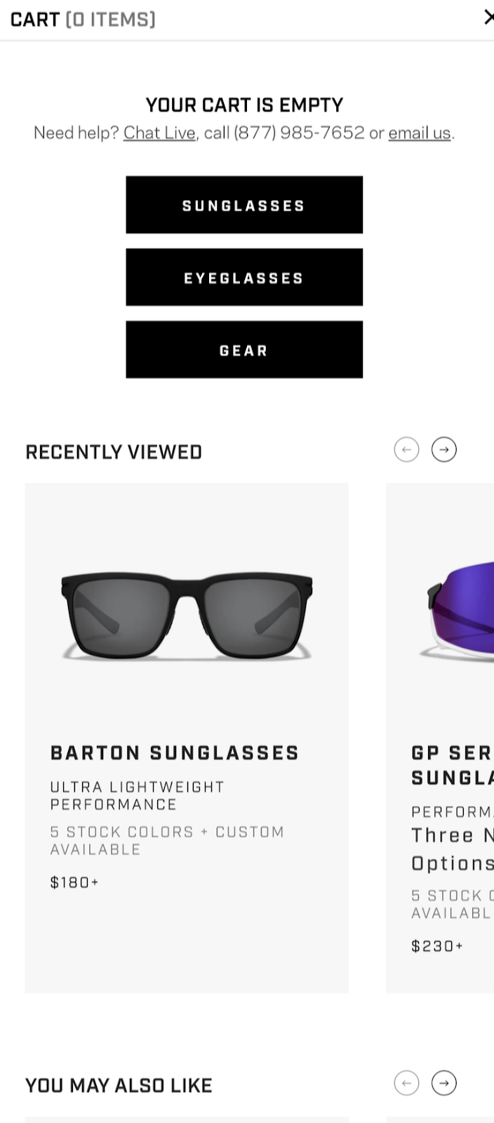
6. Make Your Add-to-Cart UX More Convenient for Shoppers
During a normal purchasing journey, a customer may be interrupted and leave your site. Adding a “Save for Later” option to your cart interface will help customers pick up where they left off.
Additionally, including a “Recently Viewed” section on your shopping cart will allow customers to quickly add an item to their cart that they may have mistakenly thought was already added. The image below shows this feature in action on the eyewear brand Roka’s website.
Additional Shopping Cart UX Tips:
- Always show full cost before checkout (shipping cost included): When a user adds something to their cart, be sure that the total price is displayed before the user reaches the checkout page. The price shown on your PDP may not be an objection to users. But if multiple add-ons, like shipping costs, only show up at the very end, you risk losing users right before they convert. It’s also wise to feature sale prices as the final cost.
- Cross-sells should be relevant: A cross-sell section in your shopping cart UI, such as “You may also like,” is a better option than a non-personalized cross-sell.
- Consider sending abandoned cart emails: Abandoned cart emails have historically high open rates.
7. Show Clear Shipping and Returns Information (including policies, price, and timelines)
When shopping online, shipping rates have a huge impact on conversion rates. And that’s especially true during the holiday shopping season when customers have a hard deadline. Make it easy for customers to find information like:
- How much shipping will cost
- What your return policies are (including how to request a return, if you extend returns for Christmas gifts, and who pays for return shipping)
- How long shipping will take
- Order cutoff dates to get delivery before Christmas
It’s not always possible to be precise, but 49% of customers will abandon shopping carts that have unanticipated shipping costs, so do your best to make it clear upfront.
Most customers will scroll to the bottom of your site when looking for this information, so make sure that your footer menu has links for shipping and returns information.
Additional Shipping Timeline UX Tips:
- Consider offering both status trackers and progress updates: Some customers may prefer to receive SMS notifications about their order over checking their email or visiting a progress update page.
- Clear progress updates: When providing updates to customers via text or on an order progress page, your microcopy should be free of jargon. Avoid using terms like “fulfilled” and prioritize a clear delivery timeline with dates instead. If shipping delays occur, communicate with your customers quickly.
8. Streamline Your Checkout Process
Your checkout process UX can be a big factor in your cart abandonment rate. Benchmark averages are around 70% and 1 out of 5 customers abandon their cart due to an overly complicated checkout process. Here are a few best practices to make your checkout experience more seamless.
1. Reduce the number of form fields
Nobody likes filling out endless forms, especially when shopping. Reduce redundant fields wherever possible. For example, allow customers to check a box that indicates their billing address is the same as their shipping address.
2. Allow for Guest Checkout
Forcing customers to create an account during checkout will lead to a higher cart abandonment rate. Always allow a customer to choose “Guest Checkout” when they don’t want to go through the steps of creating an account.
This is especially important during BFCM as you’ll have more first-time customers during the holiday season. Making it easy for new customers to place their orders without any extra inconvenience is critical.
3. Offer Third-Party Payment Options
Offering third-party payment options at checkout, like Amazon Pay, PayPal, or Shop Pay, allow customers to complete their purchases more quickly. These applications store a customer’s credit card information for seamless use across multiple online retailers.
Additionally, offering customers the option to use a “Buy Now Pay Later” (BNPL) payment methods like AfterPay or Klarna help customers break down higher price tags into smaller, more manageable monthly payments.
In 2021, 91% of merchants saw revenue, average order value, or conversion rate boosts after offering BNPL options. Providing BNPL options during Black Friday and Cyber Monday will likely encourage more customers to participate in your upcoming sales.
9. Add Gifting Features to Help Customers Get into the Holiday Spirit
Throughout the holidays, many customers want to send a product as a gift. The option to pay for an item to be gift-wrapped, or to include a personalized message, can add a small touch of delight and encourage holiday shoppers to visit your site again in the future.
When designing your gifting UX, try to:
- Make it clear what gift options are available before a customer is checking out.
- Allow customers to send the gift item to either the recipient’s address or their own.
- Distinguish items added to their cart from gift items and non-gift items
10. Get More Human: Make it Easier to Access Your Customer Services
In the age of ChatGPT, it can be a hard sell to advocate for human customer service reps, but BFCM and the holiday shopping season can be a stressful time for your customers. A “live chat” widget at the bottom of your site makes it easier for customers to ask shipping questions, track their shipments, or confirm details about your products.
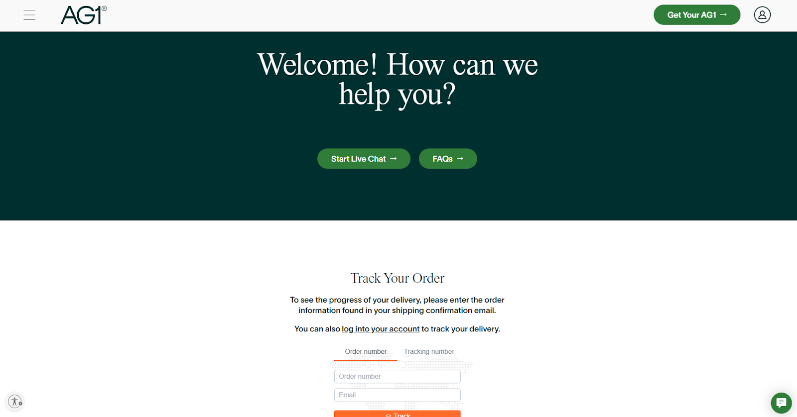
Friction in the retail experience often comes from hesitation. If the customer isn’t sure about something (“Is this right for me?” or “Will this arrive in time?”) they’ll often just close the page. If you make it incredibly easy for them to find the answers, they’re more likely to convert.
ChatGPT and other AI-based chatbots are good for your bottom line, but your customers overwhelmingly want to speak to other humans; most studies show between 70% and 86% prefer speaking to human customer service agents over chatbots.
11. Show Fun, Shoppable Lifestyle Images of Your Products
Featuring your products in inspirational lifestyle imagery on your website is a great way to capture a customer’s interest. But don’t stop there. The products you showcase in your lifestyle photography should be easy to find. Including direct links to products allows customers to seamlessly find a product that may have caught their interest.
Mobile shopping is more prevalent than ever before. In 2021, almost 43% of all Black Friday purchases happened on mobile devices. And in 2022 that number climbed to 47%.
It’s worth focusing on your mobile UX as much as on your desktop UX. That’s because mobile users have somewhat different needs than desktop users. Here are three ways you can improve the UX of your mobile-friendly site.
1. Place Product Information Where Customers are Scrolling
On mobile, placing product information where customers are actually scrolling is crucial for increasing conversions. For example, utilizing clickable, expandable tabs that reveal more information can help keep a customer’s screen clean and easy to read.
However, these expandable tabs should be aligned vertically on a page instead of horizontally. When customers are scrolling up and down on a brand’s PDPs, they’re more likely to miss information not directly in their field of view.
Additional Tips on Placing Product Information for Mobile Customers:
- Try to put important content above the fold. While it’s a common myth that customers don’t scroll below the fold (they do), placing your most engaging, essential information above the fold helps encourage a customer to scroll down.
- Be sure to include generous white space on your PDPs. Text and copy with space between sentences, or broken up with bullet points is much easier to read on mobile devices.
2. Design Hit Areas for Thumbs, Not Mouse Pointers
Can you count the number of times you’ve miss-tapped a link or button while browsing the web on your mobile device? Thumbs and fingers are simply not as precise as mouse pointers on computers.
The Nielsen Norman Group suggests that “interactive elements must be at least 1cm x 1cm to support adequate selection and prevent fat-finger errors.”
Providing sufficient hit areas for mobile customers helps reduce the risk of mistakes, and most importantly, allows a customer to give their undivided attention to browsing your products.
3. Mobile Product Catalog Navigation: Always Leave Breadcrumbs!
Breadcrumbs are visual navigation UI that helps a customer understand where they are on a website. Breadcrumbs also enhance a customer’s browsing experience by illustrating what product collection a customer is currently viewing, and where a customer can go to find similar products.
Even though a mobile device has a built-in navigation UI, an eCommerce website should still include breadcrumbs as part of its mobile UX. Without breadcrumbs, customers might find navigating your site to be confusing and frustrating. Especially since the majority of customers are familiar with breadcrumbs and have used them before, so they’ll expect to find them.

Wrapping Up
For a successful holiday shopping season, your website speed and UX are paramount, because they contribute the most to your customer experience. During Black Friday and Cyber Monday, eCommerce sites will have an influx of new site visitors alongside a large turnout of existing customers.
It’s more important than ever to have your website performing at its absolute best. Online sales are likely to be at their highest volume than at any other point in the year. So, you should take the time to ensure your customer experience is enhancing your brand’s reputation – not hindering it. Because even with the best deals or deep discounts, a lackluster UX is going to leave money on the table.
Design a High-Converting Store Experience with Anatta
Your store’s UX is directly tied to your success as a DTC eCommerce brand. And the stores that have consistently high conversions place their customers’ needs at the center of their store design. Anatta’s UX team designs storefronts that put your customers first – and follow eCommerce best practices that have been proven to drive leading KPIs.
Ready to make the most of BFCM this year? Get in touch with our team.
- Authors
- Name
- Nirav is the CEO and founder of Anatta. Nirav received his engineering degree in 2006 from George Washington University. Prior to Anatta, he served as founder of Dharmaboost, a software company working with Cisco Systems, Hewlett Packard, and New Leaf Paper. He is also cofounder of Upscribe, a next-level subscription software for fast growing eCommerce brands.

